

HTML provides tags for displaying information in a list format. List tags are not just a single tag, but rather involve using two tags in a nested structure, which can cause UI issues if not properly understood. Apart from simply displaying lists, list tags are also used for menu items, as seen in the tasks we handled. It’s important to remember both the specifications of list tags and their practical uses, as they are commonly utilized in real-world applications.
目次
Types of List Tags
First, let’s look at the types of list tags. There are three main tags:
<ul>: Used for unordered lists with markers.<ol>: Used for ordered lists with numbers.<li>: Used to place list items.
Among these, <ul> and <ol> indicate the start of a list. Inside these, you use <li> tags to define individual list items. The structure is typically as follows:
<div>
    <ul>
        <li id="menu-1">Menu 1</li>
        <li id="menu-2">Menu 2</li>
        <li id="menu-3">Menu 3</li>
    </ul>
</div>

<style>
    ul {
        width: 320px;
    }
    li {
        padding: 20px;
        font-weight: bold;
    }
</style>
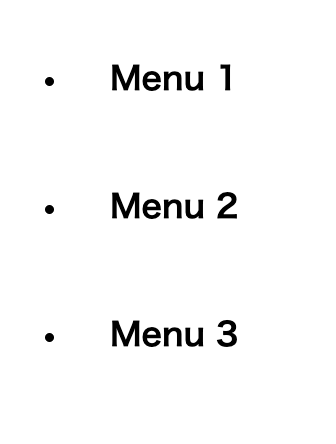
With the <ul> tag, unless specified in CSS, markers appear on the left side. The content of the li tags appears right next to the marker. The <ol> tag for ordered lists is used when the order of list items is meaningful.
<div>
    <ol>
        <li id="menu-1">Menu 1</li>
        <li id="menu-2">Menu 2</li>
        <li id="menu-3">Menu 3</li>
    </ol>
</div>

<style>
    ul {
        width: 320px;
    }
    li {
        padding: 20px;
        font-weight: bold;
    }
</style>
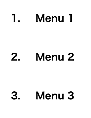
Using <ol> displays numbers where markers would be in an unordered list, with li content displayed beside the numbers.
Nested List Structures
A feature of list tags is their ability to create multi-level structures, such as nesting <ul> within <ul> or <ol> within <ol>. For example, the following code shows a menu with hierarchical layers:
<div>
    <ul>
        <li id="menu-1">Menu 1
            <ul>
                <li id="menu-1-1">Menu 1-1</li>
                <li id="menu-1-2">Menu 1-2</li>
            </ul>
        </li>
        <li id="menu-2">Menu 2</li>
        <li id="menu-3">Menu 3</li>
    </ul>
</div>

<style>
    ul {
        width: 320px;
        padding: 0;
    }
    li {
        list-style: none;
        padding: 20px;
        color: white;
        font-weight: bold;
    }
    li:hover {
        cursor: pointer;
    }
    li li {
        padding: 14px;
    }
    #menu-1 {
        background: #100952;
    }
    #menu-2 {
        background: #3826c5;
    }
    #menu-3 {
        background: #624fff;
    }
</style>
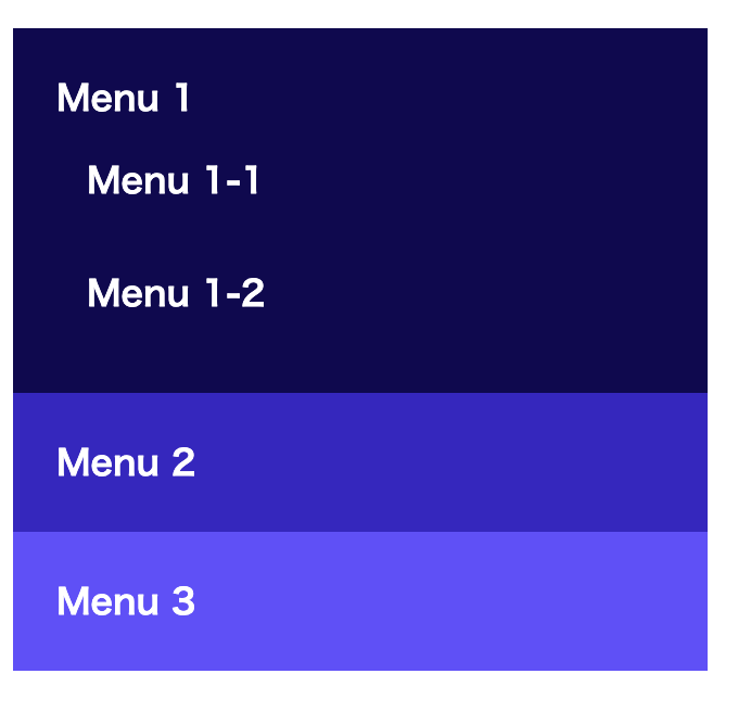
In the above code, nesting <ul> tags creates a hierarchical structure for the menu. Nested lists automatically add margin to the left, eliminating the need for additional CSS for this purpose.
Default Padding-left of ul and ol Tags
HTML’s <ul> and <ol> tags have a default indent (padding) on the left side. This helps visually represent the list and improves readability. This indent is controlled by the CSS padding-left property.
By default, browsers apply this property automatically. However, you can manually adjust this property as needed for design purposes. For instance
Learn Frontend with Skilled
At Skilled, we offer a specialized, practical programming learning service focused on frontend development.
We cover everything from coding to becoming a frontend engineer. Our service emphasizes practical learning while coding, ensuring that you gain “skills” rather than just knowledge.
We’re currently running a free trial campaign. If you’re interested, we encourage you to take advantage of this free trial.