
Creating legible and maintainable CSS code necessitates a design approach before the actual coding begins.
There are already several established design rules for CSS. In this discussion, we will introduce some of the typical CSS design methodologies.
OOCSS
OOCSS stands for Object-Oriented CSS and it incorporates object-oriented principles into CSS design. It forms the basis for many CSS design ideas.
There are two main principles in OOCSS:
- Separation of structure and skin
- Separation of container and content
Let’s look at each of these in turn.
Separation of Structure and Skin
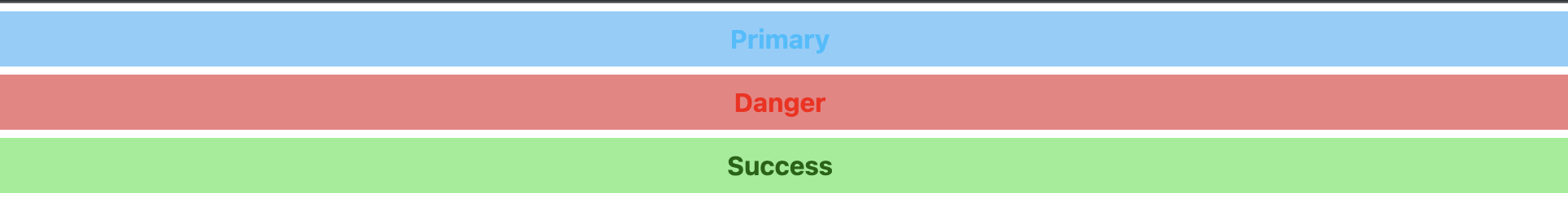
Separation of structure and skin means separating the basic structure and rules, functions, and design of components. For instance, let’s say we want to style the following alerts:
Without much consideration, one might code it as follows:
<div class="alert-primary">Primary</div>
<div class="alert-danger">Danger</div>
<div class="alert-success">Success</div>
<style>
    .alert-primary {
        width: 100%;
        padding: 5px 0;
        text-align: center;
        font-weight: bold;
        background: lightskyblue;
        color: deepskyblue;
        margin: 5px;
    }

    .alert-danger {
        width: 100%;
        padding: 5px 0;
        text-align: center;
        font-weight: bold;
        background: lightcoral;
        color: red;
        margin: 5px;
    }

    .alert-success {
        width: 100%;
        padding: 5px 0;
        text-align: center;
        font-weight: bold;
        background: lightgreen;
        color: darkgreen;
        margin: 5px;
    }
</style>
In this styling, it’s important to recognize that “the decoration other than the colors of the parts is the same.” The basic structure refers to the common parts among these components, and OOCSS suggests that these common parts should be separated. By separating the basic structure, the code can be rewritten as follows:
<div class="alert alert-primary">Primary</div>
<div class="alert alert-danger">Danger</div>
<div class="alert alert-success">Success</div>
<style>
    .alert {
        width: 100%;
        padding: 5px 0;
        text-align: center;
        font-weight: bold;
        margin: 5px;
    }

    .alert-primary {
        background: lightskyblue;
        color: deepskyblue;
    }

    .alert-danger {
        background: lightcoral;
        color: red;
    }

    .alert-success {
        background: lightgreen;
        color: darkgreen;
    }
</style>
In the example above, we have grouped the common decorations under the alert class and only specified the color differences using individual classes. By designing in this manner, the code becomes more concise and changes to the base decoration only need to be made in the alert class section, making it easier to maintain.
Separation of Container and Content
“Separation of container and content” means setting up selectors that do not depend on their location. For example, consider the following code:
#header .icon {
    display: inline-block;
    width: 200px;
}
If you styled it this way, you might want to place icons in the footer or sidebar as well. If the coding was done as above, it might look something like this:
#header .icon {
    display: inline-block;
    width: 200px;
}
#footer .icon {
    display: inline-block;
    width: 200px;
}
#side .icon {
    display: inline-block;
    width: 80px;
}
This code has a lot of redundancy as the header and footer parts have the same decoration. To correct this, the code would likely change to the following:
.icon {
    display: inline-block;
    width: 200px;
}
.small-icon {
    width: 80px;
}
In the code above, the dependency on the id selector is removed, and the small-icon class is added when a different size is necessary. Separation of container and content means decorating content without depending on a container, such as an id selector.
With the original code, if you wanted to place an icon in a different section, you would need to modify the CSS. However, with the revised code, you can add the icon without any CSS changes by simply including the appropriate class in the HTML tag.
SMACSS
Alongside OOCSS, another representative CSS design methodology is “SMACSS” (pronounced “smacks”). SMACSS makes it easier to extract patterns by dividing parts into five categories:
- Base
- Layout
- Module
- State
- Theme
Let’s take a look at each of these.
Base
Base defines the default styles for various elements in browsers or projects.
Definitions for font sizes, colors for each HTML tag, overall background color, and font family are made within Base.
html {
    font-family: sans-serif;
}
body {
    background: black;
}
h1, h2, h3, h4, h5, h6, p {
    color: white;
}
Layout
The Layout category is typically used for defining the overarching structure of the composition, usually with IDs.
It includes elements such as the header, footer, and sidebar.
#header {
    background: yellow;
    color: black;
}
#footer {
    background: darkgray;
}
As a header or footer appears only once in a page, the components that belong to the Layout category are based on the premise that they do not repeat.
Module
Almost all parts that compose the page belong here. Reusable parts such as buttons, headings, lists, tables, and alert messages are categorized under Module.
State
State is the category for defining styles that change according to different states or conditions.
.is-hidden {
    opacity: 0;
}
.active {
    opacity: 1.0;
}
A key point of SMACSS’s State is the use of the prefix “is-” for the class name, which helps in identifying the specific class.
Theme
The Theme category is considered when the page has features like theme switching.
Unlike State, which is about the state of individual parts, Theme applies to changes that affect the entire site, like a change in color scheme.
<body class="theme-dark"></body>
<style>
    body {
        background: white;
    }
    .theme-dark {
        background: darkblue;
    }
    .theme-dark #header,
    .theme-dark #footer {
        background: white;
    }
</style>
In the example above, the styles for the header and footer are altered by the “theme-dark” class. Such overall layout changes are included in the Theme category, and a naming convention of prefixing with “theme-” is used.
BEM
BEM stands for Block, Element, Modifier and the methodology involves categorizing page elements into these three sections.
Block
In the example below, the block is represented by the part .alert.
<div class="alert alert_primary">
    <h3 class="alert__title">Primary</h3>
</div>
<style>
    .alert {
        width: 100%;
        padding: 5px 0;
        text-align: center;
        font-weight: bold;
        margin: 5px;
    }

    .alert__title {
        font-weight: bold;
        font-size: 24px;
    }

    .alert_primary {
        background: lightskyblue;
        color: deepskyblue;
    }
</style>
Element
In the example, the Element is represented by .alert__title.
<div class="alert alert_primary">
    <h3 class="alert__title">Primary</h3>
</div>
<style>
    .alert {
        width: 100%;
        padding: 5px 0;
        text-align: center;
        font-weight: bold;
        margin: 5px;
    }

    .alert__title {
        font-weight: bold;
        font-size: 24px;
    }

    .alert_primary {
        background: lightskyblue;
        color: deepskyblue;
    }
</style>
There is a naming convention for Elements which is to define the name after the block name, separated by two underscores.
Modifier
The Modifier indicates variations of a Block or an Element. In the example below, .alert_primary is the Modifier.
<div class="alert alert_primary">
    <h3 class="alert__title">Primary</h3>
</div>
<style>
    .alert {
        width: 100%;
        padding: 5px 0;
        text-align: center;
        font-weight: bold;
        margin: 5px;
    }

    .alert__title {
        font-weight: bold;
        font-size: 24px;
    }

    .alert_primary {
        background: lightskyblue;
        color: deepskyblue;
    }
</style>
The naming convention for Modifiers is a single underscore.
BEM clearly separates the three blocks by the number of underscores used, making it easy to identify from the name which part of the block the styles are intended for.
The commonality in the CSS design patterns introduced here is that the common elements are objectified and grouped. Although the methods of grouping and the naming conventions differ, the basic concept is the same, which can be helpful in designing CSS.
Learn Frontend with Skilled
At Skilled, we offer a specialized, practical programming learning service focused on frontend development.
We cover everything from coding to becoming a frontend engineer. Our service emphasizes practical learning while coding, ensuring that you gain “skills” rather than just knowledge.
We’re currently running a free trial campaign. If you’re interested, we encourage you to take advantage of this free trial.