Responsive design refers to web pages designed to adapt their appearance based on the width of the display screen. For example, the same website may appear differently when viewed on a desktop computer compared to when viewed on a smartphone.
When viewed on a desktop computer: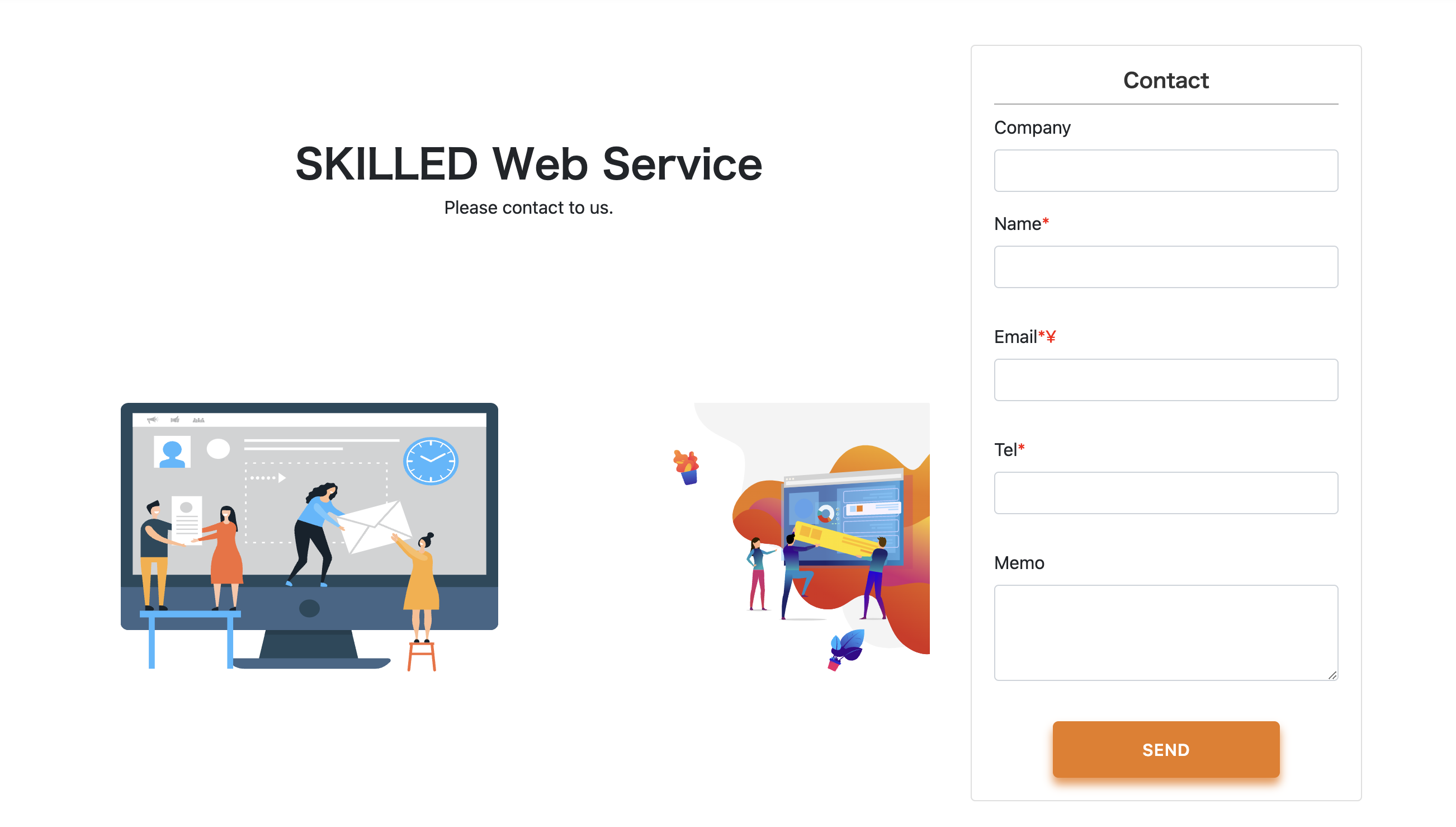
When viewed on a smartphone: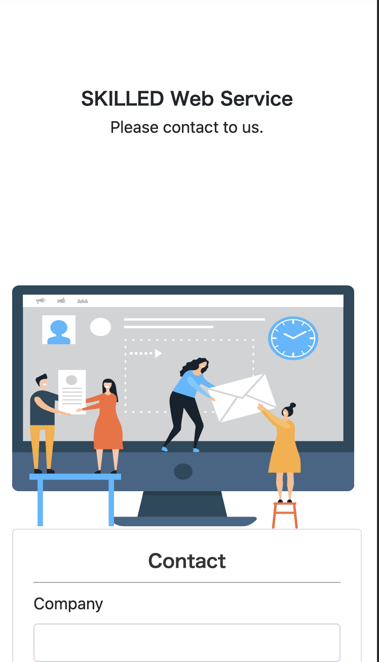
Desktop and smartphone screens vary significantly in size. With the proliferation of smartphones, it has become common practice to create designs for both desktop and smartphone displays. In this guide, we will explain how to handle responsive design during markup.
目次
Key Points for Markup in Responsive Design
Before delving into specific methods for responsive design, let’s discuss essential points to consider when marking up responsive designs. The key principle for marking up responsive designs is:
“Use a common HTML code base and adjust sizes and positions with CSS to accommodate different designs.”
While it’s possible to separate HTML and CSS code entirely for different designs, this can lead to the need for changes in two places whenever modifications are made, making code management challenging. CSS offers a feature called media queries, which allows you to apply CSS based on screen size. You can utilize media queries to implement responsive designs. Let’s explore how to do this.
Media Queries
Media queries are CSS features that allow you to apply styles based on the screen size of a web page. With media queries, you can conditionally apply styles, such as “apply specific styles only when the screen width is less than 1000px.” When marking up responsive designs, media queries are used to adjust styles based on screen size. Here’s how you write a media query:
.title {
    font-size: 64px;
}

@media screen and (max-width: 768px) {
    .title {
        font-size: 24px;
    }
}
The part that starts with @media is the media query. After @media, you specify the conditions under which you want to apply styles within curly braces {}. In the example above, the condition is specified as screen and (max-width: 768px), which means “apply these styles only if the screen width is 768px or less.” In this case, 768px is a common tablet screen width. Therefore, the .title class will have a font size of 64px on desktops and 24px on screens with a width of 768px or less. This is a common approach in responsive design markup.
Understanding Breakpoints
When using media queries to make designs responsive, you typically switch styles based on screen size thresholds known as “breakpoints.” Below are some common screen width breakpoints for different device types. While it’s not necessary to memorize these values, it’s helpful to have a general idea of typical screen sizes for different devices:
- Small (S): 576px (Typical smartphone width)
- Medium (M): 768px (Typical tablet width)
- Large (L): 992px (Typical laptop width)
- Extra Large (XL): 1200px (Typical desktop computer width)
These breakpoints are based on commonly used CSS frameworks like Bootstrap. In practice, 576px and 768px are often used as breakpoints. For instance, 576px may be used for smartphones in portrait mode, while 768px is used to ensure consistent layout for smartphones in both portrait and landscape modes. The choice of breakpoints may vary depending on the project’s requirements, so consider factors like whether the design should differ for landscape and portrait orientations and how tablets should be handled.
Handling Significant Design Differences
Media queries alone may not be sufficient to handle responsive design when the design differences are substantial. In cases where you need to change the HTML structure itself for desktop and smartphone designs, adjusting styles with media queries alone is not enough. In such cases, you can create separate classes for desktop and smartphone designs and define different markup for each. Here’s an example:
<!-- Markup for desktop -->
<div class="is-pc">
    <!-- Desktop-specific markup -->
</div>

<!-- Markup for smartphone -->
<div class="is-sp">
    <!-- Smartphone-specific markup -->
</div>

<style>
    .is-sp, .is-pc {
        display: none !important;
    }

    @media screen and (max-width: 678px) {
        .is-sp {
            display: block !important;
        }
    }

    @media screen and (min-width: 679px) {
        .is-pc {
            display: block !important;
        }
    }
</style>
In this example, elements with the class .is-pc will only be displayed on screens with a width greater than or equal to 679px, while elements with the class .is-sp will be displayed on screens with a width of 678px or less. This approach allows you to control which markup is displayed based on the screen size.
Specifying the Viewport
To make your web page responsive, it’s crucial to specify the viewport. Don’t forget to include this in your markup. The viewport is a web page’s page settings, and without proper viewport settings, a site may not recognize the correct screen width of the user’s device. It’s essential and should always be included. You can specify the viewport in the <head> section of your HTML file with the following code:
<meta name="viewport" content="width=device-width, initial-scale=1.0">
With this meta tag, the display area will be recognized based on the device’s width, ensuring proper rendering on various screen sizes.
As the prevalence of smartphones has grown, web design now demands considerations for both desktop and smartphone displays. Therefore, knowledge of media queries is essential for markup. Make sure to grasp these concepts firmly to excel in responsive design.
Learn Frontend with Skilled
At Skilled, we offer a specialized, practical programming learning service focused on frontend development.
We cover everything from coding to becoming a frontend engineer. Our service emphasizes practical learning while coding, ensuring that you gain “skills” rather than just knowledge.
We’re currently running a free trial campaign. If you’re interested, we encourage you to take advantage of this free trial.